Showing posts with label exhibitions. Show all posts

Sunday, 17 July 2016

Uncovering the lost library of John Dee: exhibition reflections

The biggest (though not the only) project on which I’ve been working over the last couple of years has been the creation of the exhibition Scholar, courtier, magician: the lost library of John Dee. It’s the first time the Royal College of Physicians museum has dedicated one of its temporary exhibitions primarily to rare books, and it has been the RCP’s most successful exhibition (in terms of media coverage and visitor numbers) to date.

I first suggested the idea of holding an exhibition of John Dee’s books (of which the RCP holds the largest known surviving collection) in January 2013, only a few weeks after I started working there. So this has been a project that has lived with me for a good long while. It’s been a long slog and one of the hardest things I’ve ever worked on. It’s also one of the most rewarding things I’ve done, and one of those about which I feel most proud. Credit is due in huge part to the museum team at the RCP who did all of hard work.

I wrote an article for the May 2016 issue of CILIP Update magazine about the process of putting the exhibition together. After a month’s embargo, I’m now able to share it directly online.


I’m continuing to reflect on the process, and will continue to do so for quite a long time, I suspect. I’ve written up a different version my thoughts here, in case it’s useful.

Things that are particular to John Dee

  • John Dee had such a varied and complicated life that it’s hard to know where to start writing about him or describing what he did. He’s a well-known figure but doesn’t have any famous things named after him, or one book to his name that everyone’s heard of.
  • The books are pretty difficult to interpret: they’re mostly written and annotated in Latin, many of the subjects are complicated to explain, most of the authors are not very well known. And taken as a whole, Dee’s age had a very different world view to ours. It’s hard to explain all of this satisfactorily in short captions.
  • We were expecting a wide audience for the exhibition: from rare books and bibliographical experts, people who’ve read widely on Dee, those generally interested in Tudor history, to people who’d never heard of Dee or never looked at an old book before. That made it hard to know where to pitch the text: it takes a lot of crafting to create descriptions that explain technical details without being baffling to the non-expert or obvious or simplistic to those with specialist knowledge.
  • A lot of the ‘facts’ about Dee’s life and books are, in fact, not 100% certain. Hedging around issues makes for less compelling reading and add lots of words to text. But you can’t portray as certain truth something for which you know there isn’t hard evidence. Cue further tinkering with the text, adding and removing lots of ‘may have been’s, ‘is believed to have’s, ‘has been suggested that’s and so on.

Worst bits

  • I found Dee as a subject completely overwhelming. It took a really long time to get a sense of just what the exhibition would really be about.
  • At some points it felt like progress slowed to barely a crawl: collaborating with other teams required a lot of sending ideas and files back and forth to get every concept and every detail correct.
  • However carefully you plan, there’ll always end up being a time when it feels like everything’s happening at once. For me, this was definitely the final week of installation, where the work of actually making sure everything looked good in the cases seemed to take a back seat to media interest and promotional demands as we were installing

Best bits

  • I really wasn’t looking forward to day when we tried out the actual layout of each of the display cases with the books themselves: I feared that it would show that all of my ideas were unworkable and that we’d have to go back to the drawing board. However, it was actually really good fun, and incredibly exciting to see the exhibition start to take shape in front of our eyes.
  • I made a few gifs of some of the exhibits, which proved to be more wildly successful that I could have possibly imagined. I thought they were maybe a bit naff. Or at least a bit niche. But #earlymodern Twitter and beyond really took to them. Bonus: making them was really fun.
  • We devised an audience engagement/participation activity by the name of #DoodleDee: here’s a blank postcard, why not leave us an exhibition-inspired doodle (for the chance of a monthly prize)? I had no idea people would take it up so keenly, and imaginatively. There have been some really charming (and bizarre) doodle submitted.
  • Opening day was amazing. It’s very very rare that, after doing something, I genuinely feel pleased with it and can sit back and bask in the warm glow of pride and satisfaction. This was one of those occasions. There are, of course, things I would change if I could, or wish I had done differently, but nothing so much that I’m unable to appreciate that what was achieved is good.

Things I learnt about myself

  • I really, really, don’t like uncertainty in the early stages of a project like this. For some people, the myriad possibilities and options are exciting and stimulating. For me, they threaten to be completely stymieing. I have to impose some order – for example, making arbitrary decisions about content and arrangement – in order to make progress.
  • While I have an eye for (some) details, and a clear idea of what ‘right’ will look like, I don’t enjoy having to request corrections from other people, especially if it takes more than one attempt to get corrections implemented. I went through agonies when we were proof-reading the design work. I need to learn a way to say ‘[this bit] needs to look like [this thing]; it currently doesn’t have [something or other]’ without worrying that I’m being a malicious control freak.
  • Even though I started out not knowing... my priorities – both large and small scale – did emerge. It was surprising to see what I did, and didn’t, consider vital: the orientation of an image on the wallpaper mattered a great deal, but I really didn’t mind changing the placement of the display cases on the gallery even at the last minute.
  • I didn’t really know what the exhibition was about, or what the overall story was until I started given tours to journalists the week before we opened. I would have done well to start imagining the tours well before that.

Advice

  • Start early. No, earlier than that. Synthesising information takes time; the sooner you’re on top of the facts and figures, the sooner (and more easily) you can get down to the creative side.
  • Take notes. Take more notes. Tiny details will suddenly take on huge important as deadlines approach. Future-you will love past-you if you’ve written down as much as possible. Don’t trust your memory!
  • Know your strengths and weaknesses. What are your usual failure points? Let your team know, and what they can do to mitigate!
  • Guess. Sometimes there just isn’t a right answer, or, at the very least, not one you can work out right now. So guess: pick an option and try it out. If it’s not working you’ll know soon enough and can change. If it is working then you’re sorted.
  • Know your priorities. If some things need to change and you’re not too concerned, then let them go gracefully. There will be some things you’ll really want to stand and fight for, and you’ll know it when it happens; save you energy for those.
  • Build in flexibility from the start. If you pick one option from two-or-more equally as good (or more-or-less as good) options, keep a note of those you didn’t choose, in case the first idea doesn’t pan out.
  • Don't forget your passion. It can be easy to overlook the things, objects or ideas that made you go ‘wow’ right at the start. Keep them in mind: they’re the best selling point.
  • Trust your exhibits. Let them tell their story. Work out what the key feature of each item is, and make sure that’s what you communicate to your visitors. Know exactly why each item has been included.
  • Promote early, promote often (and use the professionals). The huge coverage for ‘Scholar, courtier, magician’ was the product of three things: Dee’s cult status, giving plenty of notice (a year plus) about the exhibition, and hiring a professional publicist.
Lots of people have asked me what come next after Dee. For the museum, it's a new show about the Great Fire of London. At the moment for me it’s ‘More Dee’: we’re reworking the exhibition text into a printed catalogue of the exhibition.  After that? I’ve no idea. I’m sure something will come along...


Wednesday, 9 March 2016

John Dee: how I made the exhibition gifs

The RCP library has the largest known surviving collection of books owned by John Dee, the Elizabethan polymath. In several of these Dee’s signature has been over-written or obliterated by a man called Nicholas Saunder.

It’s possible to disentangle the two different signatures if you examine them very closely. As part of the exhibition research I edited an image of them in order to show Dee’s original signature and then Saunders’ over the top.

Astrologiae iudiciariae ysagogica. Jean Taisnier, published Cologne, 1559
I’d hoped to use this image in the exhibition proper, and to display it next to the book itself. The image didn’t make the final cut, but we’ve been using a gif (animated image) of the two different signatures fading in and out as part of the exhibition publicity.


I started with a high-quality close-up photograph of the signatures, and I edited it using Photoshop Elements. Other photo-editing programmes (such as are available, such as the free GNU Image Manipulation Programme) and would work just as well. The functions will probably look a bit different, though

As in the editing process I described earlier, you need to use layers to create gifs. Layers are like old-fashioned sheets of acetate that you can pile up on top of each other. You can edit what’s on each layer individually, and can set the transparency (and other attributes) of each layer.

You need to make one layer for each individual frame of the animation.

For this animation, the frames followed this progression:
  • Original image alone
  • fading in the layer which highlights Dee’s signature (ie by decreasing that layer’s transparency step by step)
  • fading in the layer which highlights Saunder’s signature
  • fading out the layer which highlights Dee’s signature
  • fading out the layer which highlights Saunder’s signature
  • original image alone.
I started with a copy of the Photoshop file I’d made to extract the two signatures. Then, for each frame of the animation, I did the following:
  • set the transparency(/ies) of the overlay layer(s)
  • duplicated the overlay layer(s) and background layer (you need to keep the originals to continue working with them)
  • used ‘Merge down’ to stick the overlay layer onto the background layer – to make the one single layer needed to run the animation
  • re-named this new layer to say which transparency value(s) were used.


The transparency value were more-or-less as follows:
  • No overlay
  • Dee on its own: 10%, 20%, 30%, 40%, 50%
  • Dee at 50% with Saunder at: 10%, 20%, 30%, 40%, 50%
  • Saunder at 50% with Dee at: 40%, 30%, 20%, 10%, 0%
  • Saunder on its own: 40%, 30%, 20%, 10%.
After all the layers were ready, I made sure they were in the correct order (you can drag and drop to move them around).

Then I duplicated the first and frames a few times so that they would show for longer.

So save as a gif us the File>Save As option, and choose ‘gif’ (‘CompuServe gif’) as the file type. Tick the ‘Layers as Frames’ box. In the next dialogue box, tick ‘animate’ and then choose the frame rate. Remember to save the Photoshop file, too, in case you want to change things later!


And that was it, more or less.


I used more-or-less similar processes to make the other exhibition gifs. Some were much more straightforward: I just took lots of slightly different photos of a book with the camera mounted on a tripod, in the fashion of traditional stop-motion animation. It’s then just a case of layering up those images, by cutting and pasting them into a Photoshop file.

John Dee: photo editing to reveal hidden signatures

The RCP library has the largest known surviving collection of books owned by John Dee, the Elizabethan polymath. In several of these Dee’s signature has been over-written or obliterated by a man called Nicholas Saunder.

Astrologiae iudiciariae ysagogica. Jean Taisnier, published Cologne, 1559

It’s possible to disentangle the two different signatures if you examine them very closely. As part of the exhibition research I edited an image of them in order to show Dee’s original signature and then Saunders’ over the top.


Months and months ago I showed these images to a group on a visit to see some John Dee books from the CILIP RBSCG annual conference. I promised to explain how I'd made them, and at long last, here's a how-to.

I started with a high-quality close-up photograph of the signatures, and I edited it using Photoshop Elements. Other photo-editing programmes are available (such as the free GNU Image Manipulation Programme) and would work just as well. The functions will probably look a bit different, though.

The first step is to create a new layer. Layers are like old-fashioned sheets of acetate that you can pile up on top of each other. You can edit what’s on each layer individually, and can set the transparency (and other attributes) of each layer. Create your new layer via the layer menu.


Next, I painted the new layer white using the bucket tool.


Then I set transparency of the new layer to around 40%. You can switch which layers you can see by clicking the little eye icon next to the layer name.


To reveal one of the signatures, I used the eraser tool to remove areas of the white layer, to reveal the full-colour ink beneath. There was no magic involved – just a lot of careful editing, using the book itself as a reference. You can change the size and shape of the eraser tool using the controls at the top of the window. If you erase too much then you can add it back using the brush.


I used exactly the same procedure to uncover the Saunder signature. It took ages, with plenty of switching between the two to check that all the bits of ink were accounted for.


When I was happy with the images, I saved each as a separate jpg file, and saved the Photoshop file so that I could come back later and tinker with the images further.

I’d hoped to use this image in the exhibition proper, and to display it next to the book itself. The image didn’t make the final cut, but we’ve been using a gif (animated image) of the two different signatures fading in and out as part of the exhibition publicity. Watch this space for a post about how I made the gif itself.

Monday, 7 March 2016

John Dee gifs part the second

Following the success of the John-Dee-inspired gifs I put together for #musgif day in October 2015, our publicist asked if I could make a few more to use in the promotion for 'Scholar, courtier, magician'. So I duly obliged.


I was quite blown away by how popular all of the gifs were, and with the fulsome praise and enthusiasm they received especially among the early modern history crowd on Twitter.


They were picked up by various media outlets, too.It wasn't such a surprise to see one crop up on Hyperallergic, but New scientist used them, too. Pretty cool. (Although, if I'm honest, the fact-checking in that December 2015 article leaves a something to be desired. The more recent review is rather better, but gif-less, seeing as it went out in print.)

The gifs are successful because they fun to watch and because they add something to the understanding and experience of the books and painting by showing things you can't see from a photograph or from seeing the static item on display.

Watch this space for a post or two about how I did the photo editing on Dee's over-written signature and how I made the gifs.

Thursday, 22 October 2015

Rare books gifs - John Dee, volvelles, apples and things

Culture Themes is a twitter account that organises monthly themed days on Twitter, primarily for museums. This month it was museum gifs - #musgif - and I put together a couple for the RCPmuseum account from some of the star objects from the RCP's forthcoming John Dee exhibition.

To make the first three gifs, I set up the department camera on the department tripod and took a series of photos, stop-motion animation style. Then I layered up the individual images in Photoshop (other editing software is available), cropped them, resized them and saved them as gifs. To make the last, I took a pre-existing photograph and played about with it in Photoshop.

It was quicker and easier that I thought it would be, and I'm delighted with how well the gifs show off the materiality of the books.

If you like rare books gifs, then have a look at what's being posted on Tumblr at places like University of Iowa Special Collections.

One of twelve volvelles in Trithemius, Polygraphie, 1561. The title written on the fore-edge of this book suggests that it belonged to John Dee. It's a book about cryptography, and the volvelles are cipher discs used to encoding or decoding text.

Three-dimensional geometry explained with foldout diagrams in Euclid, trans Billingsley, The elements of geometrie, 1570. This was the first English translation of Euclid, and John Dee wrote an extensive preface to it.

A very hungry bookworm works its way through John Dee's annotated copy of Quintilian, Institutionum oratoriarum, 1540. 

Crab apple tree in Parkinson, Theatrum botanicum, 1640.

The RCP library has the largest known collection of books from John Dee's library. They're catalogued online in the library catalogue.
 
Addendum: I ended up making another three John Dee gifs and wrote up how I did it.

Sunday, 16 November 2014

What are we here for and where are we heading? #dcdc14

At the end of October I went to ‘Discovering Collections, Discovering Communities’ (#dcdc14), a collaborative conference between The National Archives and Research Libraries UK, exploring ‘the ‘discoverability’ of collections across different formats, institutions and professions’. It had a focus on archive and museum collections and institutions, and was held at the new Library of Birmingham. The full programme is here (pdf link) and video of sessions will be going up in due course.

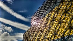
Birmingham Library by Chris(UK), on Flickr
Creative Commons Creative Commons Attribution-Noncommercial-No Derivative Works 2.0 Generic License   by  Chris(UK) 
There were 9 panel sessions and 10 workshops split over the two days. I went to:
  • Panel 1: Exploring the mechanics of cross-sector collaboration
  • Panel 6: Visualising the digital discovery
  • Panel 7: The community within: volunteers as a route to discovery
  • Panel 9: Collecting - for whose sake?
  • Jisc Workshop: Finding and Using Digital Collections: Do we need new tools?
There was a lot of interesting and engaged discussion on the Twitter hashtag, which cut across the different sessions and themes and helped to make connections between them. I think it’s also the first conference I’ve been to that had an end-of-day summary session in which each panel chair gave a short summary of their session. I found that very useful, too.

I found it interesting to hear about lots of different projects going on at institutions of different sizes, and in different sectors – archives, museum, and library. It’s easy to forget the different approaches of the three domains, given how often they’re lumped together as ‘heritage’ or ‘memory institutions’. It came out early on that museums have a very different attitude to research use compared to archives and libraries: it’s what the latter two exist to facilitate (in large part), but it’s not what a museum is set up for. So when a keen academic turns up to a tiny museum and spends a long time looking at artefacts or talking with the curator, that can feel like a huge investment of time for the museum, with little tangible reward.

Three broad themes appeared to me over the three days. So, as ever, I won’t précis each session I attended, I’ll throw together some thoughts under headings.

Representation

This is something that I think all of the first three panels touched upon, but which certainly struck me in a session that was ostensibly about cross-sector collaboration. One speaker mentioned that in a museum display of archival material exploring ‘hidden histories’, people to whom no photograph or artefact could be attached had to be omitted from the display because of the visual demands of displays.

In the social media panel there was discussion of the double-edged sword of high-volume but low-depth attention: can we call click-bait archives images that go viral (44 medieval beasts that cannot even handle it springs to mind) successful engagement? Or, under what circumstances can we call that successful engagement, and how to we balance the demands and delights of that kind of promotion with archival collecting and use that allows for and encourages the discovery of more complex, more nuanced, stories and understandings?

It’s a concern that digitisation, an increased focus on exhibitions, and/or a focus on social media overly privilege the visual and the tangible and disadvantage the textual? Lots of people talk about their exciting online collaborative projects exposing hidden histories and forgotten stories, but I worry there’s a risk that we do this at the expense of another, doubly disadvantaged set of histories that aren’t sufficiently photogenic.

I’ve pulled together a Storify of the Twitter discussion on this topic, rather than paraphrasing it all in this post. 

Strategy

Collaborating

The first session I attended was all about the ‘mechanics of cross-sector collaboration’. We heard about the Making Britain project – a collaboration involving the BL, the OU and many others – and the Inspiring Women project – a collaboration between Tunbridge Wells Museum and the University of Kent. They both sounded like really interesting projects, but in both cases the collaboration was born out of pre-existing relationships and networks: people already knew people who’d be interested in working on the project. Now, there’s nothing wrong with using your network, but it can seem like an impossible task to create this sort of collaboration if you don’t have a handy connection already.

The third paper in the session sought to address this. The Share Academy is a project run by UCL, the University of the Arts London and London Museums Group that aims to ‘build sustainable and mutually beneficial relationships between the higher education sector and specialist museums in London’. They strongly advised taking a more strategic approach to collaboration, by taking a pragmatic approach to planning. It’s important to have collaborative relationships documented and agreed at the start: what will the outputs of the project be (academics and museums might want very different things)? What happens if and when key people move to new institutions? How much investment of time, money and resources is expected from each side?

One really striking point for me was the comment that small museums can feel used by academics who come and research their objects and then publish without seeming to give anything back to the museum. There’s a really large investment of very limited staff time involved in providing access for researchers, and it seems that museums having necessarily been doing a great job of explaining that – unlike in libraries and archives – facilitating this access isn’t part of their core work, and that they would appreciate a more equitable relationship.

Unfortunately, Share Academy is only short-term funded, so it’s not clear whether it will continue, and be able to act as the matchmaker many of us would like!

Lots of people agreed that national advice and support on setting up and running collaborative projects would be welcome, and there’s promise of this coming from TNA. In the meatime there is, for example, this report on collaborative working practices in science heritage: ‘Mind the gap’ (link via Melinda Haunton).

Collecting

Karen Pierce presented a really inspiring paper about her work on the History of Human Genetics library at the University of Cardiff Library. This is a collection of materials concerning the history of the study of human genetics.

It was conceived of by a geneticist – Peter Harper – who was concerned that the history of this comparatively new discipline wasn’t being preserved. It now includes three complete personal libraries as well as selected donations from other people’s collections. It includes printed books – including classic textbooks and other works – as well as grey literature. There was a conscious decision to collect grey literature, because it represents an otherwise undocumented stage in research: networks, transient developments, events, suppliers and so on.

(The quote of the conference was undoubtedly Karen’s two descriptions of grey literature: 'publications by organisations whose main business isn't publishing' or 'floppy stuff’. The subsequent cries of recognition and anguish from cataloguers on Twitter is worth a read.)

This paper really made me think how fine the line is, and how variable is the location of the line, between a library’s perception of something as ‘usefully collected stuff from and expert’ and ‘endless shelves of rubbish we don’t need’. There’s real, serious, professional skill in evaluating the value (current and potential) of collections particularly of this type, and sometimes the smart professional decision is to say ‘we don’t need it’, but this isn’t always so. Sometimes we need to be brave enough to say ‘yes, we’ll take it, and love it, and make it great’.

Karen’s paper was an inspiring example of how to negotiate this boundary by setting clear aims, remits and procedures for such a collection. It’s great to see that at least one place is negotiating this successfully, rather than succumbing to the inertia of the ‘bay and a half of Stuff that someone gave us three librarians ago’.

Data and the catalogue(s)

Ah, shouldn’t we have got past worrying about catalogues by now? More than once people said and tweeted ‘the aggregator is dead’ and ‘it’s all discovery now’ and so on, but in the JISC workshop on digital discovery tools I stuck my head above the parapet and pointed out that the one key thing that would improve the discoverability of my (so-far-non-digital-)collections would be better catalogue data. Or better metadata if you prefer. It turns out that I wasn’t, in fact, expressing the view of a behind-the-times old fuddy-duddy, but actually a feeling that was in the room and online, too. Never mind aggregators being dead, we’re still trying to sort out how to get stuff into them nicely.


Elsewhere, it was pointed out that even if we have all the resources to record all the stuff we want to record, we don’t have cataloguing systems that really allow us to usefully (or at all) record the stuff that makes special collections well, err, special.

A catalogue record for a Shakespeare first folio? Quite possibly won’t mention that it is the ‘first folio’. Probably can’t easily link through to that amazing exhibition you had about it last year. May manage to link through to the digitised version you have, though not necessarily. Unlikely to record other context or importance... As curatorial tools, and tools for the people Out There to understand our stuff, there’s a lot that’s still desired.

(Incidentally, the problems of what’s in the catalogue not matching what the users are looking for also cropped up a recent event at Harvard. We can’t easily meet the needs of researcher’s who’re interested in all sorts of copy-specific features, because they just haven’t been recorded. This extensive conversation is well worth a read – it brings out several different issues affecting our ability to achieve this.)

In summary...

There’s so much going on out there, and there’s so much that we can all do in our services (big or small). There’s huge pressure to do more, to reach more people, to work with more people, to get out stuff out there as much as we can. This is facilitated by things like social media, the spread of digitisation projects, and so on, but these tools don’t themselves ensure that we’re doing things well. We need to keep in sight that we should be doing stuff for a reason and that we ought to be able to set and measure against criteria for for doing this stuff well would look like and we need to consider how it will be sustained in the future.

Sunday, 8 June 2014

A shoal of ganseys

'The Mo', the museum of the North Nofolk fishing town of Sheringham, is currently hosting an exhibition all about fishermen's sweaters, A Shoal of Ganseys.

2014.06.07 Sheringham groyne by Katie Birkwood, on Flickr

2014.06.07 Sheringham shoal of ganseys l by Katie Birkwood, on Flickr

A gansey is a particular type of sweater or jumper, knitted in the round with no sewn seams, most often (but not exclusively) in navy blue, using fine wool at a tight gauge or tension. They were worn by fishermen all down the east coast of the Great Britain, along the whole route of the herring fishing fleet from the Moray Firth in Scotland to Sheringham and Cromer in Norfolk. They were also knitted and worm elsewhere, including inland waterways, the channel islands and the Netherlands.


The exhibition is absolutely splendid. It displays 70+ ganseys in amongst the boats and artefacts that form the museum's permanent displays. The overall effect is very attractive to look at and very evocative. Detailed attention has also been paid to each individual knitted item; the knitting nerd can see where and when each comes from, and care is taken to demonstrate the range of different styles and techniques that were and are used, rather than reducing the tradition to one single model that all ganseys are supposed to have followed.

There's a handling collection of labelled knitted samples upstairs, so there's a chance to see the knitting up really close (with low lighting levels in some areas of the museum this was particularly welcome!) and to take away detailed inspiration for future projects.

I'd thoroughly recommend this exhibition if you're interested in knitting, coastal heritage and history, or if you're just passing through Sheringham or North Norfolk. Sheringham's lovely, too, if you like chips, ice-cream and gulls. (And who wouldn't?)

The exhibition runs until 10 September 2014. I haven't found details of these online, but the exhibition leaflet advertises knitting on the prom on Saturday 14 June, children's knitting sessions on Thursdays during the summer holidays, and a symposium 'Gathering Ganseys' on Saturday 6 and Sunday 7 September.

Saturday, 22 September 2012

Speaking truth to power: Rare Books Group annual conference 2012 (#RBSCG12)

The annual Rare Books and Special Collections Group conference took place on 12-14 September at Lady Margaret Hall, Oxford.  This was the first year I was able to attend the conference, and I have to thank the CILIP East of England branch for financial support via their small grants fund.  I also must thank the RBSCG committee for organising a superb conference, the speakers for being so interesting, the other attendees for being friendly, and the staff at LMH for excellent hospitality.

The title of the conference was ‘Speaking Truth to Power: Making Special Collections Work in Times of Recession’, so fundraising, advocacy and outreach were major topics of conversation.  I’ve written up a narrative account of the conference for the East of England branch newsletter, Sunrise, which should be available later in the Autumn. What follows here are my thoughts arranged under what I felt were the main themes to emerge from the conference.  I’ve compiled a separate list of useful webpages, projects, reports and articles.

It’s fair to point out that I’ve always traditionally been sceptical about what university development offices do: I’ve had my fair share of half-hearted begging letters from my old college, and feel pretty cynical about their attempts to wring money from me (they know I’m a librarian, so I really don’t know why they try...). Remarkable to relate, this conference really changed the way I feel how we can engage with fundraising, and so my reflections seemed to have turned out more like a manifesto.

Show Don’t Tell

Our collections are our best and most powerful advocates, not only for themselves and for the library, but for the whole institution. The collections are most effective when people see and touch them up close and personal.  The ‘thingyness’ of our things matters; a digital reproduction is nice, but it just isn’t the same as the real thing, and allowing people not only to see, but to touch, gives them a big thrill and makes them feel important and valued.  Christopher Parking described that the physicality of objects is an important part of contemporary museum education practice, where the focus is on  handling collections, kinasthetic learning, and enquiry-based learning. School groups no longer just follow clipboard trails around objects safely kept behind glass.

We should be getting the important people inside and outside our institutions into our libraries to see just what it is that makes us special.  It’s no use just writing an email or a report describing what we hold: people have to come and see it to really understand.  Obviously it’s not always feasible to let everyone handle our objects, but don’t discount the impact it can make when it is possible to allow that.

Know Your Collections

We, as librarians, are fundamental in making our collections work, as we’re the people who know most about them.  We should be prepared to market ourselves as the people who can interpret the collections. There's something in most special collections that will appeal to everyone and anyone, so librarians are vital because we know what that item will be. This can make a big difference when, for example, the development office are bringing round potential donors.  We’re also important because we’re the people who know best just what a difference extra funding could make.

Our knowledge as librarians is what can make a big difference to academics, too.  They need access to our holdings to support their teaching, and they need access to our knowledge to help further and inform their research. Central to getting our collections used in research is getting them all catalogued, not only locally but as part of national and international indexes, and making the catalogue data available in useful ways.

It’s no longer acceptable for institutions to have basements of unknown collections, often the legacy of indiscriminate and undocumented collecting in the past.  So we need to take the initiative in working out what we have.  This is something that Manchester Public Library have been doing during the current refurbishment: they’ve been assessing what was, and what should be, stored in their closed stacks, and working out how that can be used in the future.

Know Your Institution

It’s not always easy to do, but you need to work out who has the power in your institution, and be prepared for the fact that once you’ve identified who that is, they’ll probably keep changing.  Alison Cullingford noted that people can have positive power (they can make things happen) and negative power (they can stop things happening).

Mark Nicholls gave a very clear account of the ways in which we can gain power for ourselves and influence those others who hold the positive and negative power.  He notes that "The worst mistake of a college (or any) politician is to be absent": we should do what we can to get on as many committees as possible and to cultivate allies on the others.  It’s important, he noted, to realise that those in charge can and will make decisions quickly when the time is right.  We have to be good at working out what ideas are right for the moment.  This gets easier as time goes on: one successful project, and attendant praise for the institution, will prime the organisation (and its nay-sayers) for further success.

Neil MacInnes and Judy Faraday both described the ways in which they were using special collections to further the aims and agendas of their institutions.  Manchester Public Libraries special collections are being used to engage communities that the local authority holds as priorities, including black and ethnic minority communities, place-based communities, and young people.  The materials held by the John Lewis archives and the community archives centred around the locations of John Lewis stores helps to support the partnership’s business cycle.  It does this both by providing materials for business use, including publicity and design, but also by creating community support and interest.  I suppose that you could call this latter effect ‘soft advertising’ - in any case, it’s part of the partnership’s commitment to corporate responsibility.  It’s important to be explicit about how your activities are supporting the mission and goals of your organisation.  Don’t just do it, but make sure everyone knows you’re doing it.

Know Your Audience(s)

We have lots of different audiences for our collections, activities and fundraising efforts.  Our traditional audience, academic readers, are still very important. Anne Welsh commented that their voices can be important in times of uncertainty, and that their support for services and collections can be vital.

There’s a general support for libraries and special collections amongst the general public.  Although there’s often a rather clichéd and unfair impression that we’re just old and dusty, this support is still something we can and should work with.  Richard Ovenden mentioned the one-day display of a copy of Magna Carta at the Bodleian: lots people will queue up to see something if you advertise it well, and this will generate positive publicity for your institution.

When considering external funders, Mark Nicholls advises that we can improve our image easily for example by producing a professional and attractive annual report.  Oliver Urquhart Ivine described British Library work creating partnerships such as that with the Qatar Foundation.  They took time and effort to research potential donors in depth, and to plan how they will approach and encourage potential donors.  This advice chimed with Mark Nicholls caution that we have to anticipate potential objections to our plans and be prepared to knock them away one by one.

When planning fundraising efforts, Sean Rainey commented that it’s important to realise that there’s a difference between funding priorities and fundraising priorities. We have to recognise what things donors will and won’t be prepared to donate towards.  We won’t have much success campaigning for retrospective conversion, small facilities improvements, and supplies and equipment purchases, so we need to look critically and objectively at our plans and decide what we can realistically achieve via which means.

Don't Be Complacent

In straightened times it’s important to keep ourselves front and centre in the minds of the people who make the decisions.  This might seem mercenary and drastic, but it can make all the difference.  There are plenty of collections and collecting areas that are sadly under risk.  As well as recent high-profile threatened libraries, Richard Ovenden and Alison Cullingford both identified twentieth-century collections that haven’t traditionally been regarded as ‘special collections’ as areas that may not be receiving the attention they need now to be preserved for the future.

Fundraising, I think, isn’t something that comes naturally or easily to librarians.  We like to think that the importance of our collections is not merely monetary, and that their cultural and intellectual value will ensure they receive adequate support without our having to bring out a begging bowl.  But that, sadly, isn’t the case.  We need to make the case for our collections, and to use the existing mechanisms for fundraising (development offices, funding bodies, donors, and so on) to attract support.  Sean Rainey ended his paper by enjoining us not to let fundraising slip down the to-do list, and I’ll echo what he said: start working on it now.

Monday, 14 May 2012

Mobile technology and special collections: a perspective on the #mlibs conference

Last Tuesday saw the Mobile Technologies in Libraries Information Sharing Event, held in Birmingham and organised by the m-libraries project. As someone who's a late-adopter of technological gadgets (I got my first laptop last Autumn), I didn't take detailed notes throughout the day, and chose to consider the broader aspects of the topic and not the details.  There is lots of information about the individual sessions on the event Lanyrd page.

Throughout the day there were interesting discussions about what we mean by 'mobile' technology, and whether it is possible or useful to make a distinction between mobile technology and other technology.  My own view is that very soon the distinction will no longer be of any use, as what we now call 'mobile' technology will be the predominant kind of technology being bought and used.  At the moment the designation can be useful - it brought together people for this information-sharing event, at least, but it's very important always to focus on what service we're trying to offer, and not merely on the medium through which we're providing it.

Of course (as James Clay pointed out in his keynote) not all of our users are using this technology, and not all of them ever will.  We should make sure that all of our content is available in other ways too.  But people are using it now, and we have to make sure our services are available to them via their preferred device.

Design is key to providing any web-based service, but particularly in making it accessible from the multitude of devices now available.  Matt Machell gave a presentation about Responsive Web Design, which is a must-watch for anyone with an interest in web design and the *how* of making content accessible to mobile devices. (He linked to this super piece on User Interface Design, recently too, which is definitely worth looking at if you're interested in this sort of thing. As is Your Library Website Stinks and it's your fault.) The key is to create a flexible site that can adapt to whatever device is viewing it.  This requires planning from the start -- it's hard to retrofit -- but it saves you time and effort in the long run as you only have one site to keep up-to-date, your content is your own rather than being subject to app-store control, and your users get a much better experience as the service will look and feel the same across all the devices from which they're using it.

 The mobility of mobile technology is, of course, particularly relevant to apps that use geo-spatial data to provide information about your current location.  The Phone Booth Project at LSE (presented by Ed Fay) displays Charles Booth's late-nineteenth-century annotated maps of life, labour and poverty London for the user's current location.  They're laid over a Google Maps base, so you can closely compare the modern city with the historic city.  As the overlaying of data works just based on geographic location co-ordinates, it's possible to add further layers, such as modern deprivation information, or information from Booth's notebooks, very simply.  Georgina Parsons had a great idea for extending one of Surrey Libraries' current outreach projects: how about constructing a walking-tour map of a local area, with audio (talks, readings, music?) relating to literary (or other) history available around the route?

I was really interested in the session about the SCARLET (Special Collections using Augmented Reality to Enhance Learning and Teaching) Project at the John Rylands Library, University of Manchester.  The project has been investigating how to use augmented reality (AR) in teaching and learning with special collections.  I have to say that I'm not sure that I completely agree with its brief:
SCARLET addresses one of the principal obstacles to the use of Special Collections in teaching and learning – the fact that students must consult rare books, manuscripts and archives within the controlled conditions of library study rooms. The material is isolated from the secondary, supporting materials and the growing mass of related digital assets. This is an alien experience for students familiar with an information-rich, connected wireless world, and is a barrier to their use of Special Collections.
Yes, locating the useful secondary material relating to rare books and manuscripts can be quite a specialised skill, and one I fear isn't uniformly well-taught to undergraduates at the point at which they start accessing the special collections for their study and research.  However, most special collections reading rooms have reference books, allow the transfer of modern books from elsewhere in the library, and allow laptops to be used.  Granted, they might not all have wifi yet, but I was genuinely surprised to hear that this was considered one of the 'principal obstacles' to the use of Special Collections for teaching and learning.  From the student's point of view I would have thought that just not knowing where to start and what to order up, and then how to interpret what has been requested (e.g. how to find particular sections in a manuscript or early book, how to read the handwriting or typography, how best to handle the material, etc.) would be the biggest issue. From a teaching perspective, practical concerns such as arranging a time and location for a teaching visit, negotiating the level of supervision from library staff, and just thinking of it as an option in the first place, would seem to be big concerns. But I'm willing to believe I could be wrong, and would really like to hear what other people think.

Some of the AR content that SCARLET have produced really blew me away.  In particular, using AR to overlay a reconstruction and translation of this second-century papyrus fragment of St John's gospel.  This seems like just the sort of thing that technology should be doing.  The project say that feedback from first-year undergraduates has been very positive - they appreciate having a way to get to see and use the special collections materials that they've never previously used.  Third-year students enjoyed the videos of their course lecturers, but felt that on the whole the content was somewhat prescriptive and didn't allow for their own independent research.  These findings concur with what I might have expected: I'm not sure why I would want to produce a video-ed introduction to the material unless it really wasn't possible for students to receive such an introduction in person from their lecturers.  Not least because, when using special collections for the first time, it's good to have introductions to how to handle them properly.  I suppose that for students who've had some experience, but who still aren't at the advanced research stage, this content could be valuable.  Maybe I'm a curmudgeon, but it does still seem like a lot of effort for an unclear goal.  As I've already said, I'd love to hear other people's thoughts.

I'm not down on all AR, though.  I can see enormous potential for exhibitions (if issues of wifi/network connections and managing lighting to meet conservation requirements but also allow for the visual-recognition tech underpinning the AR to work in exhibition spaces can be overcome).  Having a reconstruction, or a translation, or annotations and explanations laid directly over the exhibit itself seems like a so much better way to interpret materials than with just a printed caption.  Audio, video, other images, complete digitisations, and more could all be accessible in the exhibition space in connection with the items on display.

All in all it was an interesting day - my thanks to Jo and the rest of the organising team.

Thursday, 19 April 2012

Pinterest: some thoughts

It's hard to move on GLAM blogs at the moment for posts about Pinterest, one of the hottest new(ish) social media sites in town.

What is it?
'Pin Cushion' by Philippa Willitts on Flickr
Obligatory picture of some pins (1)
Pinterest is a tool for discovering, collecting, arranging, annotating and sharing images you found across the web. For me, its main strengths are both aesthetic and technical:
  • it looks great;
  • it automatically links every image back to the page from which it was 'pinned'.
It's a powerful combination of attractiveness (and ease of use) and usefulness (linking images back to their homepages: so a picture of a cake links back to the recipe, for example).

What are people doing with it?
People are using Pinterest to collect together images and ideas around a multitude of themes: boards about weddings are popular, as are recipes, home decorating, and crafts.

You can find out what's been pinned from your webpages by using a URL in the form http://pinterest.com/source/yourURL/, e.g.:
Just remember to remove the "http://www." bit from the front of the URL. (Tip o' the nib to Anne Clark.)


How is this different to Flickr?
Well, for starters, it's not just about publishing your own images: it's a tool for bringing together images from lots of different sources.  But even from the perspective of an institution wishing to create boards of its own photographs, Pinterest is much more easily social than Flickr, and it's much quicker to navigate.

Special collections folk - some ideas for what we could be doing
Pinterest provides a medium dedicated to finding, sharing and commenting on visual items.  It's one that lots of people are using, and it's one that facilitates following items back to source if you want to find out more.  It seems like a great forum for getting our stuff Out There.  A few things spring to mind:
  • put a 'pin it' button along with other social media sharing options next to images on your collections pages or online exhibitions pages - this will give visitors explicity permission to pin the pictures and thereby share them outside your usual visitor base.  Lots of people will likely pin even without express permission, but it's good to be clear if you want to encourage this!
  • use it to promote your own collections
    • either for quick and dirty online exhibitions, or to highlight particular items from a physical exhibitions.  I love this Brief History of Manchester made by Manchester Archives.
    • pinning your own things is easy - you can either pin from your own website, or upload images direct to Pinterest
    • you can also draw together material from other places that relates to your holdings in some way. Kettle's Yard art gallery has put together 'If you love Kettle's Yard you'll love...".
  • It's easy to change your pins and boards whenever you need to.
'Pins' by Richard Heaven on Flickr
Some more pins
Copyright
There has been much discussion about whether and how Pinterest and its users violate copyright.  It's quite possible that pinning copyright images on Pinterest constitutes a violation of copyright, although that's not certain yet. I am not a copyright lawyer, and I don't know what the definitive line on this issue is.  However, there are ways of using Pinterest without using copyright images at all: if you use images to which your institution holds the rights (with appropriate institutional agreement where required), or if you use creative-commons-licensed images (in accordance with the licence terms), or copyright-free images.  It means you can't pin and re-pin at will without a moment's thought, but it's worth being punctilious when acting institutionally!

Monday, 9 April 2012

Three #museums in Oxford

A couple of weeks ago I went over the The Other Place for a conference about library history.  The conference was very interesting, but I did manage to sneak a bit of time away from it to visit some of the other attractions of Oxford, and I thought I'd record some of my thoughts about what I liked.

A doorway in the Bodleian Library quad
photo by me
Bodleian Library Exhibition: The Romance of the Middle Ages
This exhibition looks at the variety of stories captured under the heading 'medieval romance', and how this genre has influenced later writing, right up to the present day.  It's a vehicle for the exhibition of a great number of medieval manuscripts, alongside some artefacts and some archival material.
  • I really enjoyed the selection of exhibits, and the way they were presented. Objects, such as ivory panels and a floor tile are displayed alongside books and texts, thus brining to life both the expected and unexpected exhibits by bringing out some of their wider cultural and artistic contexts. The inclusion of archival material from C.S. Lewis, J.R.R. Tolkein and Terry Jones was also very successful, because of the thematic links and their links to Oxford.  The inclusion of modern material may have seemed gimmicky if there weren't such strong connections with the rest of the exhibition.
  • The exhibition makes good use of the space available.  I appreciated the free exhibition guides at the entrance, and that there is a small shop (which doubles as a supervisor's desk). Two computers are also available, nicely screened off the main exhibition area, to allow visitors to explore the online exhibition.  It might seem redundant to have the online version available in the physical space, but I think that it's good to be able to explore the exhibition in more than one way, and as you can zoom in to the online exhibits, it can be easier to read them and to see the fine detail than is the case with physical object in a case.
  • My favourite exhibits:
Oxford Museum of the History of Science
This museum, housed in the original building of the Ashmolean Museum, has an enormous collection of scientific instruments spread over three floors, as well as a special exhibition area that mounts changing displays.  I only had time for a quick look round, but made a note to remember:
  • It's a cluttered, busy space, which isn't necessarily a bad thing but might be difficult to navigate for a new visitor.  This difficulty is mitigated by having a really clear, obvious floor plan displayed right in front of the entrance. It sounds like a silly little thing, but it stopped me getting too confused!
  • Another thing that helps a visitor navigate somewhere where the cases are very full and busy is that the museum guide and plan picks out highlights on each floor.  The location of these is marked, along with a photograph of the object in question and a short description of what it is.  This helps to establish a way to approach the visit.  Obviously, the museum's choice of highlight object might not match the individual visitor's favourite(s), but it's a nice way to start exploring. 
  • Again, there were computers available, this time allowing the exploration of current and previous exhibitions, and searching of the collections.
  • Favourite exhibits:
The Ashmolean Museum 
 The Ashmolean Musuem is enormous, and I only saw a little of it.  But I still had some thoughts:
  • Galleries 3 and 4 are dedicated to museum conservation work, and I particularly liked an exhibit that showed the effects of repeated touching on museum objects.  It was made from variety of materials (silver, silk, limestone, gilded picture frame), with half of each covered by a clear perspex screen.  Visitors are invited to touch the exposed side, and touches are recorded on an electronic counter.  Even the most study of the materials (the stone) was clearly showing damage, and the silk had completely disintegrated.
  • The museum has a liberal photography policy, which allows the use of cameras, without flash, for private non-commercial use, except where stated otherwise.
  • The museum actively uses Twitter: I asked a question about the availability of the collections online, and had a helpful and friendly response well outside working hours! The only downside is that I couldn't find this advertised on their website (a missed opportunity?) - I found the Twitter account by searching Twitter itself.
  • I had lots of favourite exhibits, including: